Spring 2007 Fashion Color Report
by Pantone, Inc.
New York Fashion Week, September 8-15, 2006
New York fashion designers are flourishing
in a season of new beginnings, using
surprising neutrals with innovative splashes
of corals, yellows and purples to create a
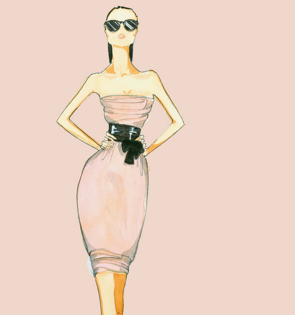
spring in bloom.Tarragon is the freshly cut
stem to the blossoming shades of sweet
Strawberry Ice, warm Golden Apricot
and violet-infused Hollyhock. Café Crème
is the rich, creamy contrast to the serenity
of calming Sky Blue or the deliciousness of
refreshing Grapemist. The yellow glow of
gleaming Green Sheen and the blushing
beauty of diaphanous Silver Peony reflect the
infusion of life brought by spring.
While cool Frost Gray was an important presence
in fall of ‘06, the newest neutral for spring is found
in glimmering Opal Gray, providing the background
to spring’s multifaceted, complex brights that can make
even the most basic silhouette come alive.
“Most often, colors are not completely reinvented each
season,” observes Leatrice Eiseman, executive director of
the Pantone Color Institute®. “Instead, they evolve from one
season to the next. The Apple Cinnamon of fall, for example,
becomes the Café Crème of spring. What does change each
season is the variation of the colors, and/or the combinations
of colors. While navy, black and white are still a presence for
spring ‘07, designers are choosing a greater variety of neutrals
as the canvas for this season’s captivating new hues.”
For 13 years, Pantone has surveyed the designers of
New York Fashion Week to bring you the season’s
most important color trends. This sketchbook previews
color for spring 2007. It is also available online at
www.pantone.com/spring2007
Nessun commento:
Posta un commento